Creative
Branding, Illustration & Photography
Reinvigorate its core range of Brains-branded cask ales from the autumn of 2019
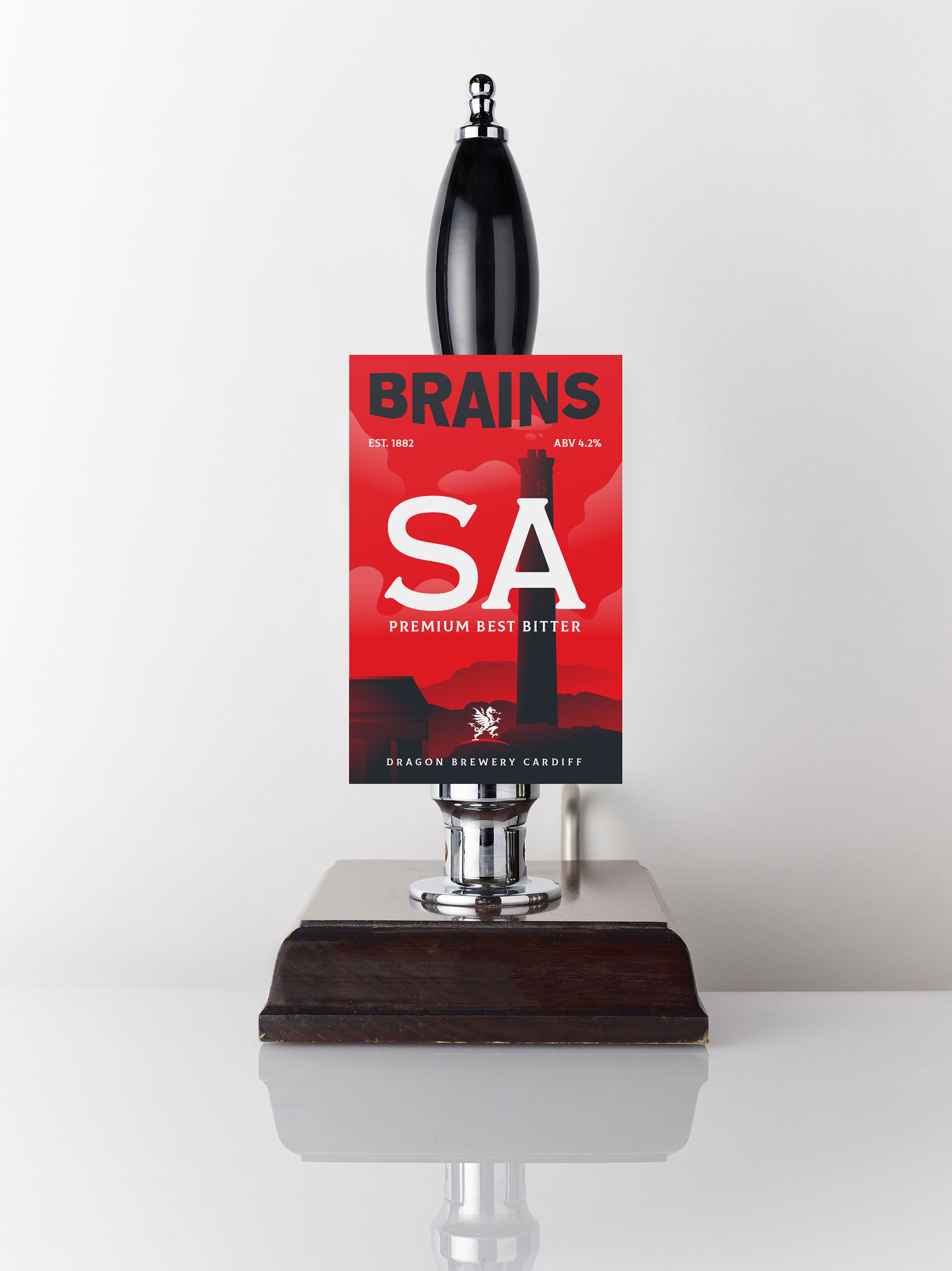
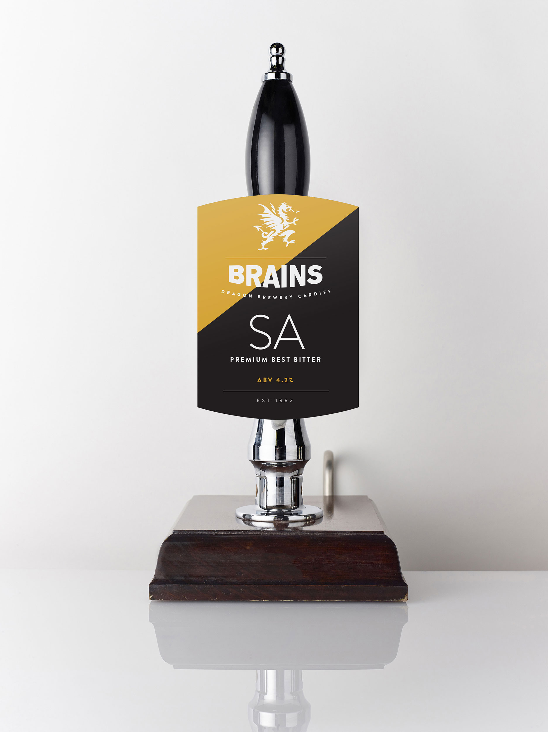
Aim: Simplification, clean, readable typography, flat design which will give the pump clips focus, clarity, versatility and reflect a modern look.
These were a few of my favourites designs.
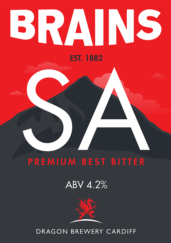
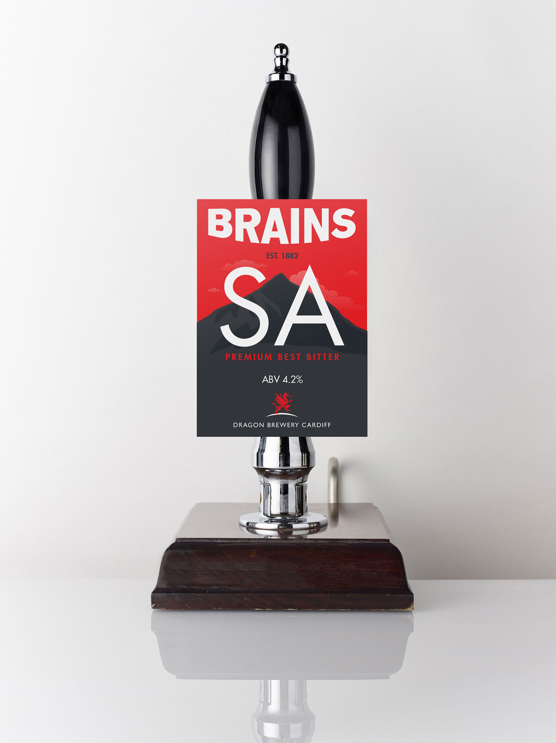
Snowdown is the highest mountain in Wales. It’s scale and presence is easily similar to those associated with the Brewery who are largest and longest running purveyors of fine Welsh beers. The peak of the mountain is illustrated and creates the platform for the brand of beer. Keeping in mind the values of having a clean flat design.
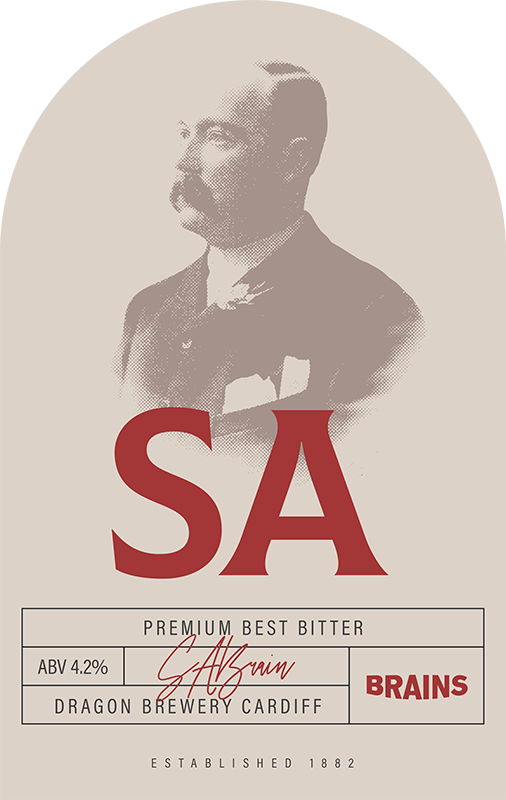
Honoring the iconic founder Samuel Arthur Brain with a commemorative illustration is accompanied with contemporary label design.
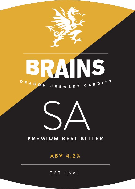
Tapping into the heart and heritage of Brains with an illustration of the Brewery, turning the home of SA Brains becomes the focal point for this design. Follows the current trend of a more simple and flat design, which takes the existing shield shape from the current logo, whilst stripping it back. The brand is given more presence and the colour used in this case gold / yellow would signfiy the product type i.e. beer, bitter, ale.
